


I was lucky to finish a few paintings at the recent art workshop here - one of a filly that is just too much fun - a bit cheeky and fit the color pink (which I don't normally use because I dislike it almost as much as purple!). But the color fit for her. I wanted to contrast the light colors hitting her back and mane with something and the pink helped that pop out, which drawing less attention to her legs.
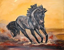
The other painting is un named right now - not 100% sure I am done, but he came along nicely at the workshop. I like to choose a contrasting background to help the horses pop out and I usually do my backgrounds first - a few layers at a time with subtle additions of color to provide some depth. These don't always come out in photos (especially on the web), but this has contrast near his nostrils to make it appear like you can see his breath.
Likely taking a break here in the new few weeks, but will get back at it with the next drop in. Enjoy...


No comments:
Post a Comment